Monday 30 January 2012

Your Pitch

Alex Sheldon -  http://youtu.be/bdH7NmGva7w
 Balpreet Atkar - http://youtu.be/P06QjBWgoVY
 Charlie Powell – http://youtu.be/Uki12-_Ff2E
Fraser Kennedyhttp://youtu.be/9g1xMub93KE
Jack Mugglestone – : http://youtu.be/pEvfY0zt7QI
Martyn Hollinshead – http://youtu.be/B3-SkgZkjqo
Michael Spierin – http://youtu.be/76979wT57BU
Molly Johnson – http://youtu.be/TUvdkWIiG4Y
Rebecca Chapman – http://youtu.be/2A_TPoS733I
Sophie Paul -  http://youtu.be/rZlJR8HAoqA

Jake Chadburn -  http://youtu.be/Pl4OvfMhROw 

REMINDER DEADLINE THIS FRIDAY!


       Monday 23rd Jan-Fri 3rd Feb
·        Lessons to pitch idea to class and receive feedback
·        Evaluate class feedback
·        Test shots of work on magazine elements
·        Complete mock version of cover/ contents page/ double page spread (1 lesson)
·        Write draft article
·        Begin composing cover/contents page/ double page spread (draft version)
       
Friday 3rd February = Research and Planning FINAL DEADLINE
Marks deducted for late submission
Students to be placed on intervention list if work not completed.
Teachers to introduce evaluation questions 1, 5

Thursday 26 January 2012

AN EXAMPLE: EVALUATION PITCH

“Overall, the pitch went well because I found out what I needed to do in order to improve my magazine, particularly the focus of it and the actual style. Before my pitch, I had an idea in my head of what I wanted my magazine to look like, however having to actually explain it to people I found possible faults with it and so I realised I needed to make a few changes. For example, I need to choose my clothes very selectively to fit my genre and to make them appealing for a magazine cover. After my pitch, I have changed my views on my colour palette, simply because the colours I chose didn't work on the magazine. However I have used variations of this original palette. I plan to stick to my ideas for the contents page by testing them out in the mock ups I will be producing. The big thing I found I needed to think about was how to make it appeal to a female audience as opposed to a more male one, because I felt that there aren't any magazines of this genre that are aimed at girls. So this is the main thing I will consider after my pitch because it I need to make sure I am targeting the right audience with my magazine.”

Wednesday 25 January 2012

HOMEWORK

'Which institution would publish your magazine and why?'

Answer the question above, ensuring you explain what institution you have selected, giving a detailed reason as to why they would want to publish your magazine. Give examples of other magazines they have published that is similar to yours.

Tuesday 24 January 2012

Tips and Advice on Layout from Clive Edwards

The first colour is white. The second colour is black. The third colour is red. Calligraphers and early printers grasped this over 500 years ago and experience has proved them exactly right. White for background, black for text, red for accent and excitement. These three colours are the best . Be very careful with all other colours.
Roger Black (designer of Newsweek, Time Out, Esquire, National Enquirer, Rolling Stone)


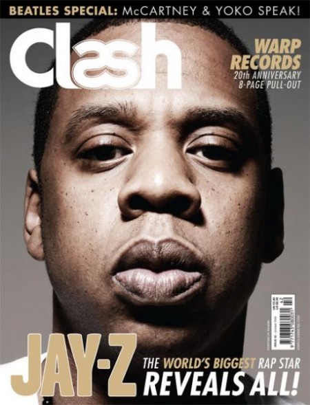
A cover should be a poster. A single image of a human will sell more copies than multiple images or all type. Always has, always will. Think about why.
Roger Black


Never set a lot of text type in all caps. After a while, it’s just too hard to read.
Roger Black


Use only one or two typefaces. Italian design is the model: a strong sense of a few things that work together. Avoid a free for all of multiple fonts/colours.
Roger Black


Get lumpy! The trouble with most design is that it has no surprise. If you want normal people to pay attention, you have to change pace in your presentation. Monotonous rhythms of picture, headline, picture, text, ad, headline, picture, ad, etc. Is like a pudding without raisins – a stew without lumps.
Roger Black


Break up type to add interest
Chris Frost – Designing for newspapers and magazines


Don’t use too many typefaces. Too much variation will end up looking a mess. It’s best to limit yourself to one font, and variations of it.
Chris Frost


Emphasise your entry point, with larger intro type, bold faces, drop letters, etc. Choose your entry point with care, and make it the focal point of the page.
Chris Frost


Even mediocre photographs attract an audience and a good news picture, even on an inside page, may attract 80% of the readership.
Harold Evans – Pictures on a Page


Just switching type face from serif to sans can result in massive differences in reader comprehension, and response, to advertisements
Colin Wheildon – Are you communicating, or just making pretty shapes? (2005)


There are few major newspapers in the English speaking world today which use the sans serif type for the body text. Conversely, many major magazines choose sans serif. Serif faces have long been regarded as highly readable. One theory is that the serifs acted as tram lines, keeping the eyes on target. Another was that the modulated thick and thin strokes of serif types provided greater opportunity for individual letters, and hence words, to be distinguished and read.
Colin Wheildon


Responses to text in printed colours showed a considerably lower level of good comprehension.
 81% said they would prefer to read the page of coloured type because it was more attractive. But the test results clearly show that in practise, they found coloured text more difficult to read. It was attractive to look at but did not make a good reading environment.
Colin Wheildon


Editors and designers are the missing link between the ape world and man.
Colin Wheildon


Every picture should have a caption. Readers get very irritated if they cannot find the caption. But the caption must not state the obvious. A picture of a vicar pouring a cup of tea, should not have for its caption: Vicar, pouring cup of tea. Captions should add to the information in the photo, not re-state it.
Many music mags use witty, tongue-in-cheek  captions.


Type size for the body of an article should be between 9-14.  (not the headlines, standfirst, crossheads etc). Some newspapers go down to 8, and many would consider that anything above 11 is too large, wastes space, and patronises the reader. 9 is the most common size.

Colours: Text on Background

Black on white is still the easiest way to present type and to read it and you change that colour at your peril. Using coloured paper, coloured type or a heavy type patch often reduces legibility. In tests carried out by Karl Borgrgrafe (cited in Favre and November 1979) to see which colours worked best together, the following taxonomy of colour mixes was discovered, starting with the most legible, and working through to the least legible.


Black on yellow
Yellow on black
Green on white
Red on white
Black on white
White on blue
Blue on yellow
Blue on white
White on black
Green on yellow
Black on orange
Red on yellow
Orange on black
Yellow on blue
White on green
Black on red
Blue on orange
Yellow on green
Blue on red
Yellow on red
White on red
Red on black
White on orange
Black on green
Orange on white
Orange on blue
Yellow on orange
Red on orange
Red on green
Green on orange

As you can see, black and white comes pretty near the top although the list suggests that a yellow panel behind the black type would improve legibility (which is why important warning signs of danger are usually printed black on yellow.)


From: Designing for Newspapers and Magazines, by Chris Frost, Routledge, 2003


Note: though black on yellow may be more striking than black on white, it is unlikely to be more pleasing in large quantities. Magazine designers have to strike a balance between legibility, impact, and reader satisfaction.
Between getting attention, and not being annoying.   CE

Make Your Pitch On Animoto

 
Use the website Animoto to make a quick and easy video for your pitch.


www.animoto.com


To log in use the following details


username lutterworthmedia1@gmail.com
password lutterw0rthmed1a1


We have 17 separate accounts, to access these simply change the number in bold in the username and password.


You MUST enter a promo code once logged in. To do this simply click on MY ACCOUNT and then enter


a4esmit31be8a


you need only do this once but once you have you have access to features which would otherwise cost you $30.

Tuesday 17 January 2012

Re-cap on Mon 16th Lesson

Photography

Composition / Framing / Rule of third
 
Examples


Lead singer – Mid Shot / Close up
Most Music magazines tend to use this format for their front covers


Photographic styles – away from the norm of Magazine Culture
Photo-journalism/Street, Fashion, Artistic

Examples

Photo-journalistic – Wide lenses

Van Halen

The Beatles by Harry Benson (photographer)


Mike Skinner of ‘The Streets’


Artistic portraits – by Rankin (photographer)

Ian Brown


Justin Timberlake – Elvis re-invention.

David Bowie


Fashion

See Kelis Photoshoot by Rankin


Lighting


Jaz-Z
 

Studio lighting focused on face – Barn doors


Kanye West / Daft Punk


Pink / green / yellow / blue (Colours taken from Daft Punk Discovery album)
Using the reflection from the motorcycle helmets

Typography - Useful Websites


Da font

MyFonts

Fontwall

Thursday 12 January 2012

Glossary Of Magazine And Newspaper Layout Terms

Here’s a glossary of magazine and newspaper layout terms – taken from a variety of sources.
There are some terms that practitioners disagree on – ‘masthead’, for example. So there are two contradicting definitions of this, and one or two other terms. Some contain advice and opinions that you may disagree with. Take your pick.

Alley: the space between columns within a page. Not to be confused with the gutter, which is the combination of the inside margins of two facing pages.

Ascender: in typography, the parts of lowercase letters that rise above the x-height of the font, e.g. b, d, f, h, k, I, and t. See descender for headline implications of these

Angle - The approach or focus of a story. This is sometimes known as the peg.

Banner: The title of a periodical, which appears on the cover of the magazine and on the first page of the newsletter. It contains the name of the publication and serial information, date, volume, number. Bleed: when the image is printed to the very edge of the page.

Block quote: A long quotation - four or more lines - within body text that is set apart in order to clearly distinguish the author’s words from the words that the author is quoting.

Body or body copy: (typesetting) the main text of the work but not including headlines.

Boost:  picture boost (usually front page) pic promoting a feature or story in later pages
Strap boost: as above, but with a strapline, not a picture

Buried lede – when the main point of the story is hidden away deep in the text. It should come first.

Byline - A journalist's name at the beginning of a story.

Callout: An explanatory label for an illustration, often drawn with a leader line pointing to a part of the illustration.

Caption: An identification (title) for an illustration, usually a brief phrase. The caption should also support the other content.

Centre of visual interest (CVI) - The prominent item on a page usually a headline, picture or graphic.

Column - A regular feature often on a specific topic, written by the same person who is known as a columnist.

Column gutter: The space between columns of type.

Copy - Main text of a story.

Cropping: the elimination of parts of a photograph or other original that are not required to be printed. Cropping allows the remaining parts of the image to be enlarged to fill the space.

Cross head: a heading set in the body of the text used to break it into easily readable sections.

Cross head - A few words used to break up large amounts of text, normally taken from the main text. Typically used in interviews.

Cutlines: Explanatory text, usually full sentences, that provides information about illustrations. Cutlines are sometimes called captions or legends.

Deck - Part of the headline which summarises the story. Also known as deck copy or bank.

Deck: a headline is made up of decks, each set in the same style and size of type.
A multi deck heading is one with several headings each different from the next and should not be confused with the number of lines a heading has. A four line heading is not the same as a four deck heading.

Descender: letters that descend below a line  (q,p,g, j) Ascenders and descenders can create unused space in large headlines.... that is one reason why tabloid front page headlines use capitals... there are no ascenders or descenders in caps, so the lines can be crammed more closely together by adjusting the leading and therefore make better use of the space and add to the impact)

Discretionary hyphen: A hyphen that will occur only if the word appears at the end of a line, not if the word appears in the middle of a line.

Double page spread: magazine design layout that spans across two pages. Usually, the design editor will arrange to spread the layout across the centre pages of the magazine, so as to ensure that the design lines up properly.

Drop cap:  a large initial letter at the start of the text that drops into the line or lines of text below.

Drop shadow: Drop shadows are those shadows dropping below text or images which gives the illusion of shadows from lighting and gives a 3D effect to the object.

Editorialise - To write in an opinionated way.

Feature - A longer, more in-depth article.

Facing pages: In a double-sided document, the two pages that appear as a spread when the publication is opened.

Filler: extra material used to complete a column or page, usually of little importance.

Flatplan - A page plan that shows where the articles and adverts are laid out.

Flush left:  copy aligned along the left margin.

Flush right:  copy aligned along the right margin.

Golden ratio: the rule devised to give proportions of height to width when laying out text and illustrations to produce the most optically pleasing result. Traditionally a ratio of 1 to 1.6.

Grid:A layout grid is the non-printing set of guidlines that designers use to align images and text in a document layout.


Grip-and-grin - A photograph of no inherent interest in which a notable and an obscure person shake hands at an occasion of supposed significance.

Headline - The main title of the article. Should be in present or future tense to add to urgency. Must fit the space provided. If it doesn’t, you are using the wrong words.

House style - A publication's guide to style, spelling and use of grammar, designed to help journalists write and present in a consistent way for their target audience.

Justify: (typesetting) the alignment of text along a margin or both margins. This is achieved by adjusting the spacing between the words and characters as necessary so that each line of text finishes at the same point.

Kerning - Adjustment of horizontal space between two written characters.

Kicker - The first sentence or first few words of a story's lead, set in a font size larger than the body text of the story.

Lead or Leading: (typesetting) Space added between lines of type to space out text and provide visual separation of the lines. Measured in points or fractions thereof. Named after the strips of lead that used to be inserted between lines of metal type.

Leader - An article that shows the opinion of a newspaper.

Leader: A line of dots or dashes to lead the eye across the page to separated copy.

Leading - Adjustment of vertical space between two lines.

lede - The phonetic spelling of lead, the beginning, usually the first paragraph, of an article. The importance of getting the main point of the story in the first sentence is regularly stressed to young journalists by editors. Don’t bury the lede. When we were taught to write stories at school we were urged to save the best for the climax. In journalism, get the climax in first, then give the context.

Masthead - Main title section and name at the front of a publication.

Masthead: Magazine term referring to the printed list, usually on the editorial page of a newspaper or magazine, that lists the contributors. Typically this would include the owners, publishers, editors, designers and production team. The masthead is often mistakenly used in reference to the flag or nameplate, which actually refers to the designed logo of the publication.


Negative space (or white space) the  area of page without text, image or other elements

Noise: A noisy image or noisy scan is one where there are random or extra pixels that have degraded the image quality. Noise in a graphics image can be generated at the scanning stage, by artificially enlarging an image by interpolating the pixels, or by over-sharpening a digital photograph. Noise can sometimes also be found in photographs taken by some cheaper digital cameras.


Orphan - First line of a paragraph appearing on the last line of a column of text. Normally avoided.

Overline: introductory headline in smaller text size above the main headline

Pull quote: A brief phrase (not necessarily an actual quotation) from the body text, enlarged and set off from the text with rules, a box, and/or a screen. It is from a part of the text set previously, and is set in the middle of a paragraph, to add emphasis and interest.
A quote or exerpt from an article that is used as display text on the same page to entice the reader, highlight a topic or break up linearity
Pull-out quote - Selected quote from a story highlighted next to the main text. Often used in interviews.


Puff piece - A news story with editorialised, complimentary statements.

Recto - Right-hand page.

Rivers:A river is a typographic term for the ugly white gaps that can occur in justified columns of type, when there is too much space between words on concurrent lines of text. Rivers are especially common in narrow columns of text, where the type size is relatively large. Rivers are best avoided by either setting the type as ragged, increasing the width of the columns, decreasing the point size of the text, or by using a condensed typeface. An often overlooked method of avoiding rivers, is the careful use of hyphenation and justification settings in page layout programs such as QuarkXpress or InDesign.

Running head:A title or heading that runs along the top of a printed publication, usually a magazine.


Sell - Short sentence promoting an article, often pulling out a quote or a interesting sentence.

Serif and Sans serif - Plain font type with or without (sans) lines perpendicular to the ends of characters.

Set flush: text set at the full width of the column with no indentation

Splash – Main front page story.

Standfirst - Lines of text after the headline that gives more information about the article, or about the author.

Standfirst: will usually be written by the sub-editor and is normally around 40-50 words in length. Any longer and it defeats its purpose, any shorter and it becomes difficult to get the necessary information in. Its purpose is to give some background information about the writer of the article, or to give some context to the contents of the article. Usually, it is presented in typesize larger than the story text, but much smaller than the headline.

Strapline - Similar to a subhead or standfirst, but used more as a marketing term.

Subhead - A smaller one-line headline for a story.

Subhead: A secondary phrase usually following a headline. Display line(s) of lesser size and importance than the main headline(s).

Talkie headline: a quote from one of the people in the story used as a headline

Tag line: a short memorable line of cover text that sums up the tone of the publication (Loaded Mag has :For men who should know better)

Tombstoning - In page layout, to put articles side by side so that the headlines are adjacent. The phenomenon is also referred to as bumping heads.

Top heads - Headlines at the top of a column.

Widow - Last line of paragraph appearing on the first line of a column of text.

Widow: In a page layout, short last lines of paragraphs - usually unacceptable when separated from the rest of the paragraph by a column break, and always unacceptable when separated by a page break.

Wob - White text on a black or other coloured background.

Wednesday 11 January 2012

Double Page Examples


Here are three completely different design layouts. Each have a various style, once again adopting the rule of a three colour palette.
When creating your double page experiment with where you position the images and text. Remember you can use layers in Photoshop to make text and images appear 3D.

Example Of Contents Pages


When designing your contents page remember to stick to a certain colour palette and use exciting eye catching typography to engage your audience.  Include strong images that relate to the text.